Earthquake Safety Card
Informational card

Concept, Icon design and Layout | 2015
This informational card was designed for English-speakers in Egypt. The goal was to make earthquake safety instructions easy to remember and visually attractive and culturally relevant. It was part of a school project

Key Messages
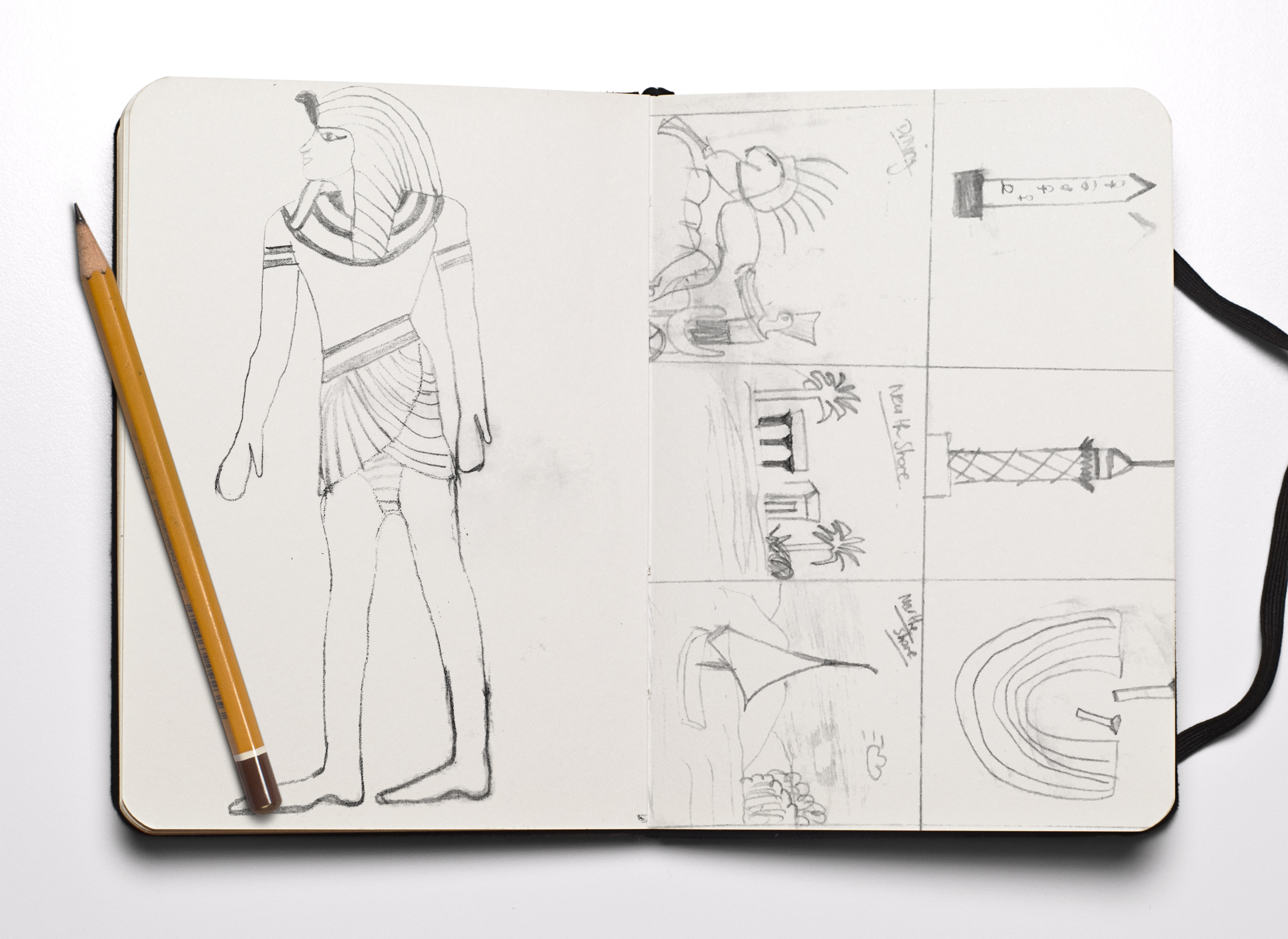
Denotative the ancient Egyptian character with every situation he could face in case of an earthquake.
Connotative TWhimsical, Modern and Entertaining.
Challenges
It was only a two colors job. Two Pantone coated colors were chosen at the end to depict the colors of Egypt.
Pantone 124 CP and 154 CP.
Visual Strategy
Chose to show the earthquake safety card in a whimsical fashion that is both acceptable and engaging for a broad audience. The slab serif typeface and the yellow colors were key to the design.
The Front

The back

